from Rob Vincent
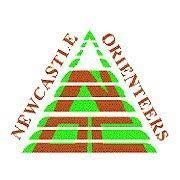
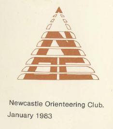
I do remember developing an original Club Logo using the "N" as the upper part of the logo, and thus with very sharp Nth top. I did talk to Alan Wright about it at the time. The Nth arrow revision with all the letters below was reconfigured later on, by Malcolm Park (who was President for a while), and a fellow of Simmons (ed: Mark Simpson). Alan Wright was very familiar with the design process back then.
Also worth bringing up the topic of "Local" Clubs within NOC. Yes, we use to run an Intra-Club pointscore, and had Intra-Club Relays. Each local "Club" had its own Logo, produced its own map/s and organised local events with their Logo on each Map......
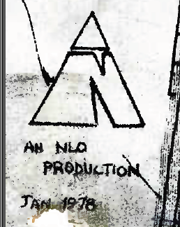
**NLO = North Lakes Orienteers (Glendale, Boolaroo, Argenton, Edgeworth)
**NLO = North Lakes Orienteers (Glendale, Boolaroo, Argenton, Edgeworth)
**MACRO = Merewether, Adamstown, Charlestown, Redhead Orienteers
**TKO = Toukley, Kincumber Orienteers
There was something at Singleton, Raymond Terrace etc too.
**TKO = Toukley, Kincumber Orienteers
There was something at Singleton, Raymond Terrace etc too.
from Ian Dempsey
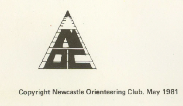
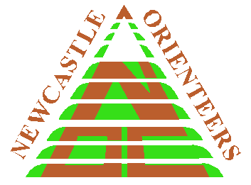
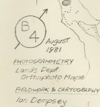
The first evidence of the NOC logo I have in my not entirely complete scans of early competition maps is from the 1981 version of Belford Forest. At that time it was a black and white logo. All earlier copies of local maps I have are either attributed to Newcastle Orienteering Club, or to one of the smaller club entities that Rob referred to. Another "sub-club" was "B4" - I can't recall what the acronym stood for. By the early 80s these sub-entities became unviable as stand alone club groups and were disbanded. There is a 1981 map with the B4 logo and another from a few years earlier for North Lakes Orienteers. The latter's logo looks like it served as the basis for the current NOC logo. In early 1983, the NOC logo on the Brush Creek map had developed some brown colour. Later that year, the North Stockton Sand Dunes map used for the Australian Orienteering Champs, with cartography by Malcolm Park, had the logo we're familiar with today.
from Mark Simpson
In 1979-80 I was studying at Newcastle University. When I moved to Newcastle I got involved with NOC and the likes of Rob Vincent, Terry Farrell and Denis Lyons, among others. I even got roped into working on the Committee and helping out. Denis used to provide the transport for Terry and I to travel to all manner of state and national events and camping in the most out there places. It was quite daunting to hang around that sort of company at the time and they were definitely out of my league, although I did do a bit of a Steve Bradbury at the ’79 ACT Champs and won bronze in the Mens 19.
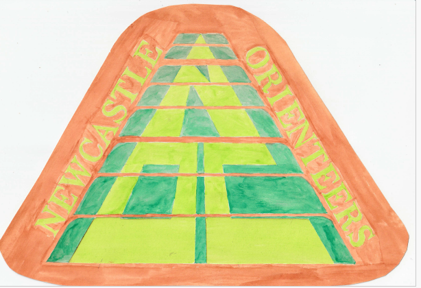
I can’t recall the exact timing but in 79 or early 80 I worked on a design for a logo so we could do a bit of "merch" and jazz up the club a bit, and the Committee were fully supportive of the idea. Rob Vincent reckoned I pinched it from his logo/north compass on his maps - the perspective N toward a point that he refers to - and he’s right, but I was the one who stylised it into a club logo adding the other letters and the “stepped” divisions.
Back then the accepted colours for Newcastle sports groups were the green and slightly off shade of brown, in case anyone is wondering why it’s green and brown. The local soccer team wore it but of course since then it’s mostly been replaced by the red and blue like the Knights wear. We had these fairly tight fitting cream cotton t-shirts made up with the logo - remember it was still the 70s - and you guys have pretty much stuck to it (the logo, not the tight cotton tees).
I still have my original artwork, a scan of which I’ve attached. As you can see it was done by hand with marker pens and I traced the font from the Newcastle Morning Herald - notice every letter still appears in the current logo. Remember this was back pre-desk top publishing and design days. It was changed slightly when it went to print but that was pretty much the logo. The main theme was the diminishing levels up to a north point. I think trying to convey a motion into the distance and in the right direction, but mostly to add to the simple N logo.
In mid 1980 I left uni early and moved back to Tumbarumba. I really had no idea how the logo was employed post 1980. The history on your web page has the stepped logo in 1981 and 1983 but the coloured logo obviously pre-dates these as it was adopted before I left Newcastle in 1980. I don’t recall anyone else being involved in the design.
I see you are celebrating 50 years of the club so it’s probably a happy coincidence that I share this story with you now. And while the fashion and style of orienteering wear has changed a bit over all these years I see the logo remains on your NOC gear and I have to say it makes me feel pretty proud. Most organisations are prone to change and updating their logo but you haven’t. This one has lasted 45 years.
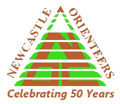
An addition to the current logo was made to commemorate fifty years since the first Annual General Meeting of the Club, which was held on 12 March 1975.
